Gap.com Redesign
The second big redesign to talk about (following up on my discussion of The Guardian), is Gap.com. After shutting the whole thing down for a few weeks and forfeiting a couple million bucks, this was (apparently) a much anticipated relaunch (I must admit I knew nothing about it until reading the Times article this morning). Luckily for me (and you), this redesign is a little more in my area of expertise than a newspaper. I'm fairly comfortable with web design and webapps and so it was with a careful eye I headed over to Gap.com (a careful eye? What is that?). Anyway, here are some screenshots:
Now if you pop over to Gap.com you'll notice that they're using technology (AJAX nonetheless) to help replicate the store buying experience. In this Times article titled New Approach From Gap to Cut Down on Clicks quotes Toby Lenk, president of Gap Inc. Direct:
"A lot of this was borrowing metaphors from the store experience," Mr. Lenk said. "When a woman walks into one of our stores, she can process things really quickly. Like when she's browsing the racks, she takes a quick look at what the sizes and colors are, picks up something and keeps going. We're trying to let her stay with the fashion.
The article continues:
"In the old world, it'd take dozens of clicks to hack through pull-down menus for size, color, style," Mr. Lenk added. "Nobody had figured out how to let someone put together an outfit and buy off one page. It's just very hard to do."
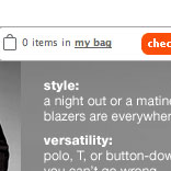
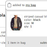
There is a lot of cool stuff going on the page, starting from the constant shopping cart floating on the right side of the screen. Rather than a little static shopping cart reminder, Gap.com is using a floating box that actually pulls down to show you its contents. What that means is there's no more need to click through to your shopping cart to see (or change) it's content. Now you can access it from any screen.
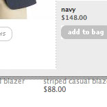
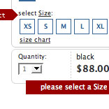
The next very noticeable change comes when your browsing clothes. Rather than forcing users to click through to find out more information and see a larger picture, which seriously disrupts the experience, Gap.com allows you to access more information as a sort-of popup within the page (this is a good popup, not a bad one). Now you can take a closer look at what you're interested and, should you decide it's not for you, check out the next item without click any back buttons at all.
There seem to be a bunch of other small things which I can't really talk about now because I can't access the site. These few screenshots and comments admittedly only scratch the surface, as I only spent about 10 or 15 minutes on the site. The big point here, though, is that these companies are realizing that they need to innovate online. The online shopping experience is still a far cry from walking into the store. Of course, that may not change until you can virtually try on clothes, but there are still ways that companies, like The Gap, can streamline the online purchase process and help make it a little more pleasurable. It's nice to go through a website and get the feeling that the company has truly thought about how people use it. Nice job Gap.
Update (9/13/05): Speak Up does a nice job of walking through the puchase process on OldNavy.com.