Redesigning the Pill Bottle
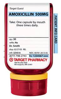
In April, New York Magazine ran a great feature story about a School of Visual Arts grad student who redesigned the pill bottle. After her grandmother accidentally swallowed the wrong pills, Deborah Adler decided it was time for a change. Her SVA thesis, called Safe Rx, was eventually picked up by Target, who debuted the new pill containers in May. Her design addresses many of the flaws of the old-style bottles, some noticeable, some not. More than anything, though, the redesign is a great design story. As Michael Beirut explains in this Design Observer story:
As someone who has tried for years to interest the general public in graphic design without much success, I can tell you straight out that this story has it all. The subject is a common object with which nearly everyone is familiar, and with which everyone is frustrated to boot. The problem to be solved is not mere ugliness (although an amber-colored prescription bottle is ugly) but literally a matter of life or death. Even the moment of inspiration is appealing: who can't relate to the story of those confused grandparents, and cheer when graphic design comes to the rescue?
The bottle looks great, and it really is a design story people can grab on and relate to.
Also, and what really made me want to write this entry, until November 23rd the School of Visual Arts is running a show titled ClearRX: From Master's Thesis to Medicine Cabinet, so if you live in New York, make sure to check it out. I'll make sure to let you know how it is after I stop by.